
In today’s digital age, having an online presence is imperative for businesses and individuals alike. A well-crafted website is often the first point of contact between you and your audience. To make the best first impression and ensure a seamless user experience, responsive web design is key. In this article, we’ll explore what responsive design is, its impact, the necessity for every website, and the SEO benefits it brings.
What is Responsive Design and Why is it Important for Websites?
Responsive web design is an approach to web development that ensures a website’s layout and content adapt and function effectively on various devices and screen sizes. Whether your audience is accessing your site on a desktop, smartphone, or tablet, responsive design ensures a consistent and user-friendly experience.
The importance of responsive design lies in providing accessibility and usability for all visitors. It means your website will look great and work well, regardless of the device used to access it. This improved user experience can lead to increased engagement, longer visit times, and ultimately, higher conversion rates.
The Impact of Responsive Web Design
Responsive web design has a profound impact on the success of your website. It enhances user experience, reduces bounce rates, and helps in improving search engine rankings. Additionally, it ensures that your website remains future-proof, as new devices and screen sizes continue to emerge.
Should Every Website Be Responsive? Why or Why Not?
While responsive web design offers numerous advantages, the question of whether every website should be responsive depends on your specific goals and target audience. For businesses looking to reach a wide range of customers, having a responsive website is essential. However, personal blogs or portfolios might find it less critical.
That said, the vast majority of websites benefit from responsiveness. With the increasing use of smartphones and tablets, it’s essential to cater to mobile users and provide them with an optimal experience. Mobile-friendliness is also a ranking factor for search engines like Google.
SEO Benefits of Responsive Web Design
Search engine optimization (SEO) is a crucial aspect of ensuring your website’s visibility online. Responsive web design positively impacts SEO in several ways:
Improved Page Speed: Responsive websites tend to load faster, which is a ranking factor for search engines. Faster loading times lead to better user experiences.
Reduced Bounce Rates: A responsive site reduces bounce rates as visitors are more likely to stay and engage with content when the site is easy to navigate on their device.
Single URL for All Devices: Responsive design keeps all your content on a single URL, making it easier for search engines to crawl and index your website.
Mobile-First Indexing: Google has moved to a mobile-first indexing approach, which means it primarily uses the mobile version of the content for ranking and indexing. A responsive website aligns with this approach.
In conclusion, responsive web design is crucial for ensuring your website’s success in today’s digital landscape. Whether you run a small personal blog or a large e-commerce platform, responsiveness can significantly improve user experience, boost SEO rankings, and ultimately drive more traffic and conversions.
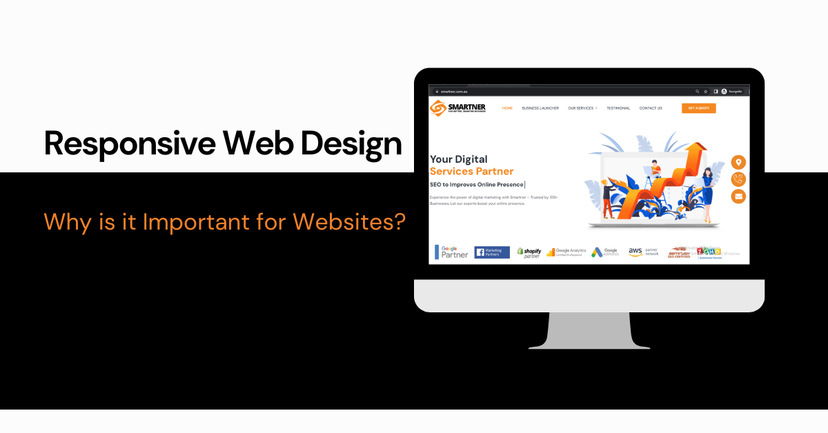
If you’re looking for a trusted website designing company that specializes in custom web design and ecommerce website design, consider us at Smartner. We have a proven track record of delivering responsive website design solutions that cater to the diverse needs of businesses. You can contact us at 0468 893 710 to discuss your website design requirements and take a step closer to a more responsive and user-friendly online presence. We will publish the blog on our own website.

Leave A Comment