
Have you ever gotten frustrated trying to navigate a website on your phone? Tiny text, buttons you can’t click, and pages that take forever to load – it’s enough to make you want to give up. Well, you’re not alone. In fact, over 50% of all web traffic now comes from mobile devices! That’s right, more people are browsing the web on their phones and tablets than on desktops.
This means having a mobile-friendly website is no longer optional – it’s essential. Today’s blog post will dive into the mobile imperative and why your website needs to be ready for it.
We’ve Gone Mobile-First
Think about it: how often do you check your phone in a day? For most of us, it’s a constant companion. This mobile-first mentality extends to how we access the internet. People are searching for information, making purchases, and even connecting with businesses on their smartphones.
Consequences of a Non-Mobile-Friendly Website
Imagine a leaky store – customers come in, but the dripping ceiling and puddles on the floor drive them away. That’s what a non-mobile-friendly website is like. Here’s how it hurts your business:
- Frustration Central: Tiny Text, Slow Loading Times, Unresponsive Layouts: Imagine trying to read a newspaper printed in ant-size font. That’s what it’s like for users on a non-mobile-friendly website with tiny text. Pinching and zooming to decipher information is a major hassle. Then there’s the loading time. If it takes forever for your pages to load, users won’t wait – they’ll hit the back button and find a website that works faster. Finally, unresponsive layouts are a nightmare. Buttons that don’t respond to taps, menus that disappear when you try to click them – these glitches make it impossible for users to navigate your site and find what they’re looking for. In short, a non-mobile-friendly website is a guaranteed way to frustrate your visitors and drive them straight to your competitors.
- Search Engine Sadness: Google Prioritizes Mobile-Friendly Websites: Search engines like Google are constantly working to improve the user experience. They know that most people are searching on mobile devices, so they prioritize websites that are mobile-friendly in their search results. If your website isn’t optimized for mobile, it will be ranked lower in search results. This means that potential customers searching for the products or services you offer are less likely to find you. It’s like having a great store in a hidden alleyway – no one will find it! Being mobile-friendly ensures your website gets seen by the people who matter most – your potential customers.
- Conversion Catastrophe: Users Abandon Ship: Let’s say someone finds your website while searching for a product on their phone. They’re interested, but the website is a mess on their mobile device. The text is tiny, the buttons don’t work, and it takes forever for pages to load. What do they do? They abandon ship! In the world of online business, this is called bounce rate – the percentage of visitors who leave your website without taking any desired action. A bad mobile experience practically guarantees a high bounce rate. This means lost sales, missed leads, and ultimately, lost revenue. By making your website mobile-friendly, you’re creating a smooth and positive user experience that encourages visitors to convert, whether it’s buying a product, signing up for a service, or contacting you for more information.
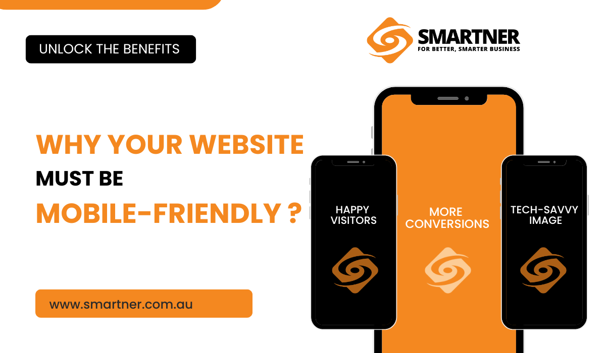
Benefits of a Mobile-Friendly Website
Having a mobile-friendly website isn’t just about avoiding problems – it’s about unlocking a treasure chest of benefits:
- Happy Visitors, Loyal Customers: Engagement is Key: Think about your favorite websites or apps. They’re easy to use, navigate, and visually appealing, right? That’s exactly what a mobile-friendly website offers your visitors. When your website is optimized for mobile devices, users can find the information they need quickly and easily. No more frustration, just a smooth and enjoyable experience. Happy visitors are more likely to stay engaged with your content, browse your products or services, and ultimately become loyal customers.
- More Conversions, More Business: Removing Roadblocks to Success: Imagine a clear path leading customers toward a sale or signup on your website. A mobile-friendly website paves that path. When your website works seamlessly on mobile, users can complete actions like making purchases, signing up for newsletters, or contacting you with just a few taps. There are no roadblocks – tiny text, slow loading times, or unresponsive layouts – to hinder their progress. This ease of use translates directly to more conversions and increased business for you.
- Tech-Savvy Image: Building Trust in the Modern Age: In today’s digital world, a mobile-friendly website is no longer a luxury – it’s an expectation. When you prioritize mobile optimization, you’re sending a clear message to your customers: you’re a modern, professional business that understands how people use the internet today. This fosters trust and credibility, making you a more attractive option to potential customers who are constantly bombarded with choices online. A mobile-friendly website positions your business as a leader in its field, ready to serve the needs of the mobile-first generation.
The mobile imperative is clear: if you want to succeed in today’s digital landscape, your website needs to be mobile-friendly. There are resources available to help you get started, from website builders with responsive design features to web development agencies specializing in mobile optimization.
Don’t wait any longer! Take the first step towards a mobile-friendly website today with Smartner. Contact us at 0468 893 710 or email us at contact@smartner.com.au. Your business and your customers will thank you for it.


Leave A Comment